Hello, and happy Thanksgiving week! So sorry I was MIA yesterday; once Lou and I landed at La Guardia from Nashville and realized it was 70 degrees in NYC, our priorities shifted to include bicycles and playgrounds and little else.
I was in Nashville visiting my friend Maria. We went to college in DC together, taught through Americorps together, and even lived together for a while. She's only recently relocated to Nashville from DC, and once she'd landed a new place and scored some thrifty furniture, she was left with a lot of cardboard boxes and a little bit of hesitation as to how to proceed. She called me for some visualization and actualization help and Lou and I made the trip down south. Bret was able to take time from a work trip for the weekend and meet us there, so it all worked out really well.
So, to Nashville! Maria lives in East Nashville, in a two bedroom apartment that has some mid-century charm, an enviable amount of storage, and a host of challenges, including taupe walls throughout that darken the space, dark brown mouldings that double down on the darkening, limited light in the kitchen and bath, and a really strange window layout in the bedrooms. Care for a slideshow?
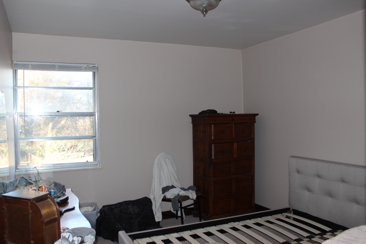
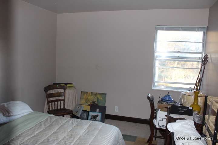
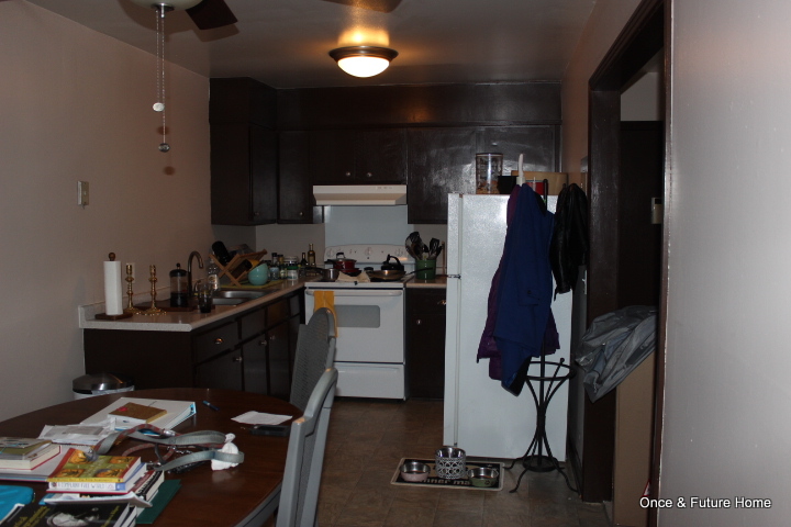
So, let's start off today with the bedroom. Maria's master is actually the smaller of the two bedrooms, but it's closer to the bathroom and the furthest down the hall, so it just felt more secluded and master-ish to both of us. When I got there, Maria had just set up her new bed (Overstock) and positioned two thrifted dressers. The first, which you can see on the left, is a nice little curved number with a big attached mirror. The second one was taller and narrower, and Mission style, with dark hardware and heavy styling. I joked that it reminded me of the Spanish inquisition. That's what we were working with. Here's where we ended up.

I should note that we are in love with this room. It manages to be both quirky and serene, which isn't a combo you see too often. It feels like a real, grown-up room, but doesn't take itself too seriously. And it's remarkably spacious feeling given its pretty diminutive size (about 12 x 11.5).
Here's what we did.
1. Edited the furniture. It was clear that there was too much furniture in this room. We moved the Spanish Inquisition dresser to the guest room, which had room for it, and moved the slightly bulky laundry basket (behind the dresser; you can't see it) to the bathroom. That left us with the bed, the mirrored dresser and a small stool.
2. Adjusted the layout. Our work wasn't done with just some editing. Though the photos don't do it justice, the clearance between the foot of the bed and mirrored dresser was tiny - maybe a foot? It felt like you had to squeeze to get by, and that was the main passageway in the bedroom. So where else to put the bed? We went back and forth and moved stuff around, and eventually settled on the unintuitive window wall.
I know a lot of people would shy away from positioning the bed over the window. Indeed, Bret and Maria both did. But the way I saw it, there was no real way to follow the "rules" in this room, and rules are for suckers anyway. Putting the bed in front of the window was a little strange, but it allowed for the bed to be centered on the back wall, and let it be the first thing you saw when you looked in the room. Since the bed is the most inviting view, I thought that was a pretty persuasive argument to keep it there. Moreover, it allowed us to move the mirrored dresser to the back, or right-hand wall. Before, walking into the room and smack into the dresser before wasn't pleasant; now you walk into airy space and a really serene vibe.There's still a fairly narrow clearance between the side of the bed and the dresser, but it's much less important now that it's not a main thoroughfare.

A calming asymmetrical bedroom layout.
3. Ditched the idea of symmetry. Had this room had a nice, symmetrical layout - like a window in a normal place - we may have striven harder to keep the bedside tables more uniform and thought that bed-centered art was the way to go. But once we decided to ignore the window and position the bed over it, it became clear that we had to OWN that decision. Rather than two matching tables, we went with one table (thrifted and relocated from the family room) and one pot of faux dogwoods (thrifted and relocated from the dining room). Then we hung the art to be centered on the wall, but not centered above the bed. Unorthodox, sure, but it sure does work for us. And we didn't totally throw out symmetry: the tall lamp is about the same height as the dogwoods, which does create some nice balance.
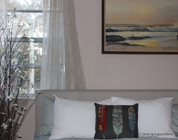
3. Added curtains. I can't stress how window treatments make a room. Don't get me wrong: some rooms are perfect without them. This was not one of those rooms. Adding these flowy numbers that Maria already had made an incredible difference in softening the room, camouflaging the window and making the bed placement seem more natural.
4. New bedding. I suggested white. I think Maria agreed just to humor me, but I know she is really happy with the choice. White bedding (like a white shower curtain) can make any room feel more airy and calm. Even this room, with its taupey walls and greige carpet. The bedding is entirely from Target. New sheets, new comforter, new duvet, new throw, new throw pillow. That pillow, by the way, was Maria's pick and I think it's a stroke of genius: it really takes the room from expected to fun and reflects her personality. The total cost clocked in at just under $150. WORTH IT. (Also, this queen bed is new to Maria; she legitimately needed bedding so I don't even count all that as a splurge).

5. Knicknacks and art. We spent $47 on art and knickknacks. The teal fox cookie jar on the dresser is Target ($20), the orange one was $2 from Walmart, and large orange ginger jar was $10 from Goodwill. The large beachy framed print was $15 from Goodwill. To say that we are smitten with that silly beach print is an understatement. This total doesn't include the dogwoods in the corner, which Maria bought for $25 and which we took from the dining room.
What we/she might do later.
1. Paint the walls. We had big plans for at least choosing a paint color for the walls this weekend, but we ended up with less time than we thought. We did bring home a test pot of Behr's Celery Ice, but we weren't able to paint a swatch yet. We chose everything with the eventual paint color in mind, so if she does paint the walls, everything should still look fab.
2. Paint the art. Though we both love the beach print, down the road, painting the frame white or even stenciling a favorite quote over it are possibilities, but it looks so good just as it is that there's no rush.
3. Add in jewelry storage. Maria has an impressive jewelry collection; figuring out how to store it without it overwhelming the space or cluttering it up will be a challenge. We've looked at those jewelry armoires but there isn't a lot of floor space so I recommend a wall- or door-mounted unit if she goes that route. She may also appropriate space from an extra closet instead.
And that's it! That's how we transformed Maria's master bedroom. She had already picked out really great pieces; I love the sleek upholstered bed and the curves of the dresser. It was just a matter of finding the best layout and adding in some of Maria's quirky fun personality without sacrificing a calming vibe. What do you think? If you're in a new place or tired of your old one, make like Maria and give me a call! We can talk through the options (with Maria, we shopped, organized and decorated). No need to host my whole fam if you're not up it - we can discuss long-distance partnerships if necessary too!
Ok, shameless plug over. Thanks for sticking with this long post. If you have questions about anything, let me know. In the meantime, I plan to post Wednesday and Friday this week (more Maria before-and-afters) so I hope to see you then!